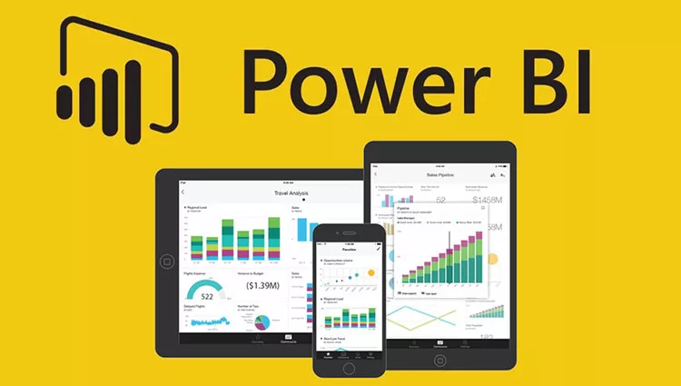
People are continuously looking for ways to show valuable information from the hof data they’re getting. Microsoft’s business intelligence tool, which is called Power BI, is used by many companies to visually analyze data. It has many features regarding many visualization techniques, but one of the users’ favorite features is the creation of a dashboard where they can actively engage with the data.
As there are many questions about what techniques to use to custom the Power BI dashboard, we created a quick “tip-book” to go through all the techniques.
How Customized Dashboard improve data interaction?
Data visualization’s main purpose is to show data in a clear way. Representing the most important information is vital because including too many pieces of information or a few of them can easily cause misunderstanding. No one wants to cause misunderstandings or misunderstood. Power BI has the most effective visual elements that users can understand right away, not spend decades analyzing them. For instance, using various colors to represent data can make it easier for viewers to see how similar concepts relate to one another. The importance of avoiding any other elements that could distract you helps the whole picture to be clear. In this context, understanding how to share Power BI reports with your team becomes a pivotal skill. By learning how to share Power BI reports, professionals can distribute impactful visual insights, ensuring that key stakeholders can make informed decisions based on clear and concise data visuals.
Here, you can find the best tips, which keep being used by many people and have beneficial outcomes among the users.
Tip 1: Use full-screen mode
For many people, it’s visually convenient to concentrate entirely on the content being shown without being distracted by other content, which is technically what the full-screen is about. Many studies say that this can improve the interface’s overall look and give a more friendly user experience. Full-screen designs can also be used to establish visual separations, directing the user’s attention to the most important aspects of the interface, not just distracting with cut screens.
Tip 2: Highlight the most important information
Everyone says it, right? “Information design makes information appealing, understandable, and enjoyable.” Actually, this saying has seeds of truth in it because it draws the audience in and puts them on a mini-journey. However, it not only makes knowledge easier to understand, but it also makes information more accessible. That’s why we strongly urge you, on each screen, to highlight the most significant themes so that your audience may quickly identify them.
You can accomplish this by:
- Using distinct colors to highlight significant topics
- Using se of a larger typeface or different typefaces for separate concepts
- Inserting them into a text box or table
- Increasing contrast so your users will see the difference
Tip 3: Make Simpler
Simplicity is essential when developing not only the design but also the Power BI dashboard. It’s critical to remember that the primary aim of a dashboard is to deliver facts in an understandable manner. No one wants to access data that is complex and needs extra effort to articulate it. Overcrowding your dashboard with information might confuse and overwhelm the user. Instead, concentrate on a few key indicators that are most valuable to your audience.
Remember, it is critical to avoid utilizing too many colors or bright images. While it may appear appealing to utilize a variety of colors to make your dashboard stand out, this might actually distract visitors from the primary message and make it more difficult to understand. Use a consistent color, such as blue or green, that is easy on the eyes and allows you to distinguish between different elements. Colors have their own perceptions, so make sure to choose your color wisely.
Tip 4: Use proper visualization for the data
If you want to create a visually appealing and consistent dashboard, the first thing you should do is establish a theme for your Power BI dashboard for setting proper visualization. We already learned that using consistent colors and fonts throughout the dashboard design saves time by eliminating the need to individually alter each chart or visualization. That’s how your Power BI dashboard has a professional appearance, thanks to a well-designed and consistent theme. Users will find it easier to understand and interact with the data shown on the dashboard. Besides colors, make the proper visual element that will match your data. For example, if you want to show differences, use graphs.
Tip 5: Learn more about dashboard design by keeping up with the developments
We keep hearing all these cliches about trends. However, not all trends are negative. Don’t be frightened to attempt new things. That’s why you should follow trends to determine your visual elements and colors. Keeping up with and implementing them is a vital skill for people working with Power BI to have. Keeping up with trends does not imply mimicking them. The goal is to be inspired by what others are doing and figure out what works best for you.
Conclusion
An effective dashboard design idea expresses the product’s aim and acts as the basis on which the product is promoted. Investing effort in developing a solid design concept lowers the chance of running into dead ends. These tips incorporate the most significant design concept, which is also important in producing reports and dashboards.